Quantile-Quantile Plot with Regression Line
A Quantile-Quantile (QQ) Plot with Regression Line is a statistical graphical method for comparing the quantiles of an empirical dataset against those of a theoretical probability distribution. The inclusion of a regression line facilitates the assessment of linearity, providing an additional measure of the goodness-of-fit for the selected distribution.
Method Overview
The .qq_plot_regression() method generates a QQ Plot enhanced by a regression line, allowing for a more detailed visual evaluation of how well the theoretical distribution models the given dataset.
Mathematical Formulation
In a QQ plot, empirical quantiles
where:
is the inverse cumulative distribution function (quantile function) of the theoretical distribution. is the -th order statistic of the sample. is defined as:
where
Regression Line
To assess the linear relationship between empirical and theoretical quantiles, a simple linear regression is applied:
where:
(intercept) and (slope) are estimated using least squares regression. represents the residual error.
If the dataset follows the theoretical distribution, the regression line should have a slope
Interpretation of Deviations
- Points closely following the regression line: The empirical data follows the theoretical distribution.
- Deviations from linearity: Indicate skewness, heavy/light tails, or mismatches in distributional assumptions.
- Steeper or flatter slopes
: Suggest different variability between empirical and theoretical distributions.
Parameters
General Parameters
id_distribution(str):
Identifier of the theoretical probability distribution under evaluation. The list of supported distributions is available in the Distributions Documentation.plot_title(str, optional):
The title of the generated plot. (Default:"QQ Plot - Regression")plot_xaxis_title(str, optional):
The label for the horizontal axis. (Default:"Theoretical Quantiles")plot_yaxis_title(str, optional):
The label for the vertical axis. (Default:"Sample Quantiles")plot_legend_title(str | None, optional):
The title for the legend. If set toNone, the legend title is omitted. (Default:"Distributions")plot_height(int, optional):
The height of the plot in pixels. (Default:400)plot_width(int, optional):
The width of the plot in pixels. (Default:600)
QQ Markers Configuration
qq_marker_name(str, optional):
The label assigned to the quantile markers displayed in the legend. (Default:"Markers QQ")qq_marker_color(str, optional):
The color of the quantile markers, specified in RGBA format. (Default:"rgba(128,128,128,1)")
Regression Line Configuration
regression_line_name(str, optional):
The label assigned to the regression line in the legend. (Default:"Regression")regression_line_color(str, optional):
The color of the regression line, defined in RGBA format. (Default:"rgba(255,0,0,1)")regression_line_width(int, optional):
The thickness of the regression line. (Default:2)
Rendering Options
plotly_plot_renderer("png" | "jpeg" | "svg" | None, optional):
The format used for exporting the plot when utilizing the Plotly visualization library. IfNone, the default rendering engine is employed.plot_engine("plotly" | "matplotlib", optional):
Specifies the backend library for generating the plot. (Default:"plotly")
Default Usage
The following example illustrates the basic usage of the .qq_plot_regression() method with default parameters:
phi.qq_plot_regression(id_distribution="weibull")This command generates a QQ Plot with Regression Line for the Weibull distribution. The default visualization settings are applied.
Complete Usage
For greater customization, the following example demonstrates how to configure additional parameters:
phi.qq_plot_regression(
    id_distribution="normal",
    plot_title="QQ Plot for Normal Distribution",
    plot_xaxis_title="Expected Quantiles",
    plot_yaxis_title="Observed Quantiles",
    plot_legend_title="Comparison",
    plot_height=500,
    plot_width=800,
    qq_marker_name="Empirical Data",
    qq_marker_color="rgba(0,0,255,0.8)",
    regression_line_name="Fitted Line",
    regression_line_color="rgba(255,0,0,1)",
    regression_line_width=3,
    plotly_plot_renderer="svg",
    plot_engine="matplotlib"
)
This implementation allows full control over the plot appearance, color schemes, rendering options, and the choice of plotting library.
Example Visualization
Below is an example visualization of a QQ plot with a regression line:
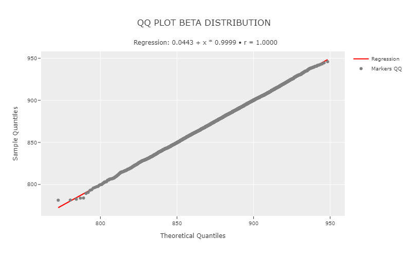
Interpretation
The alignment of points along the regression line indicates that the empirical data closely follows the theoretical distribution, suggesting a good model fit. Deviations from the regression line, however, signal potential mismatches:
- Upward curvature: The empirical data has heavier tails than the theoretical distribution.
- Downward curvature: The empirical data has lighter tails than the theoretical distribution.
- A steeper slope
: The empirical distribution has greater variability than the theoretical model. - A flatter slope
: The empirical distribution has lower variability than expected.
If the intercept (\beta_0) is significantly different from zero, it may indicate a shift between the empirical and theoretical distributions.