Plotting Multiple Candidate Distributions
The method .plot_histogram_distributions() enables the visual comparison of multiple candidate probability distributions against empirical data. This function generates a histogram overlaid with the Probability Density Functions (PDFs) of the selected fitted distributions, facilitating a comparative analysis.
Parameters
n_distributions(int, optional):
The number of candidate distributions to be displayed in the visualization. Default:10.n_distributions_visible(int, optional):
The number of distributions that are initially visible when the plot is rendered. Additional distributions can be manually activated through the plot legend. Default:1.plot_title(str, optional):
The title of the generated plot. Default:"Distributions Histogram".plot_xaxis_title(str, optional):
The title of the horizontal axis. Default:"Domain".plot_yaxis_title(str, optional):
The title of the vertical axis. Default:"Density".plot_legend_title(str | None, optional):
The title of the legend box. IfNone, the legend will not have a title. Default:"Distributions".plot_height(int, optional):
The height of the resulting plot in pixels. Default:400.plot_width(int, optional):
The width of the plot in pixels. Default:600.plot_bar_color(str, optional):
The color of the histogram bars, specified in RGBA format. Default:"rgba(128,128,128,1)"(gray).plot_bargap(float, optional):
The gap between histogram bars, ranging from0(no gap) to1(maximum gap). Default:0.15.plotly_plot_renderer("png" | "jpeg" | "svg" | None, optional):
The format used when exporting the plot with Plotly. IfNone, the default renderer is utilized.plot_engine("plotly" | "matplotlib", optional):
The visualization library used for rendering the plot. Default:"plotly".
Default Usage
To generate a histogram with the top-ranked probability distributions, the method can be invoked using its default parameters:
phi.plot_histogram_distributions()By default, this generates a histogram of the empirical data along with the Probability Density Function (PDF) curves of the most suitable fitted distributions.
Complete Usage
For users requiring customization, the method can be invoked with explicitly defined parameters:
phi.plot_histogram_distributions(
    n_distributions=10,
    n_distributions_visible=3,
    plot_title="Candidate Distributions",
    plot_xaxis_title="Observed Values",
    plot_yaxis_title="Density",
    plot_legend_title="Candidate Distributions",
    plot_height=400,
    plot_width=600,
    plot_bar_color="rgba(128,128,128,1)",
    plot_bargap=0.15,
    plotly_plot_renderer="png",
    plot_engine="plotly"
)
This configuration ensures that:
- Ten candidate distributions are displayed.
- Three distributions are initially visible.
- The visualization is generated using Plotly, with a title
"Candidate Distributions". - The legend is labeled
"Candidate Distributions".
Example Visualization
Below is an example output of .plot_histogram_distributions(): 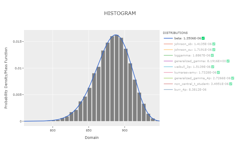
This visualization method enables an immediate assessment of the empirical data in relation to the theoretical distribution fits, supporting rigorous evaluation of candidate models based on their relative goodness-of-fit.