Histogram
The plot_histogram() method generates a histogram representation of the dataset. This section details its parameters, usage scenarios, and a sample visualization.
Parameters
plot_title (str, optional):
The title displayed on the histogram. Defaults to"Histogram".plot_xaxis_title (str or None, optional):
The label for the horizontal axis. If set toNone, the axis label is omitted.plot_yaxis_title (str or None, optional):
The label for the vertical axis. If set toNone, the axis label is omitted.plot_legend_title (str or None, optional):
The title of the legend. If set toNone, no legend title is displayed.plot_height (int, optional):
The height of the plot in pixels. Defaults to400.plot_width (int, optional):
The width of the plot in pixels. Defaults to600.plot_bar_color (str, optional):
The color of the histogram bars in RGBA format. If omitted, the default Phitter color scheme is applied.plot_bargap (float, optional):
The proportional gap between histogram bars, where0represents no gap and1represents the maximum possible gap. Defaults to0.15.plotly_plot_renderer (str or None, optional):
The format for exporting the histogram image when using Plotly. Accepted values include"png","jpeg", and"svg". If set toNone, the default Plotly renderer is applied.
Default Usage
If no arguments are provided, the function applies its default parameters:
phi.plot_histogram()This command automatically generates a static or interactive histogram, depending on the rendering backend.
Complete Usage
The following example illustrates the full utilization of available parameters:
phi.plot_histogram(
    plot_title="Histogram",
    plot_xaxis_title="Values",
    plot_yaxis_title="Frequency",
    plot_legend_title="Dataset",
    plot_height=400,
    plot_width=600,
    plot_bar_color="rgba(0,128,200,0.7)",
    plot_bargap=0.15,
    plotly_plot_renderer=None
)
All parameters are optional, and any omitted arguments default to the values specified above.
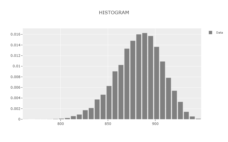
Example Visualization
Below is an example of the output generated by the plot_histogram() method.