Quantile-Quantile Plot
A Quantile-Quantile (QQ) plot is a statistical graphical tool used to compare the quantiles of an empirical dataset against the quantiles of a theoretical probability distribution. This visualization helps assess the goodness-of-fit of the assumed distribution.
Methodology
The QQ plot is constructed using the following steps:
- Compute the empirical quantiles from the dataset.
- Compute the theoretical quantiles from the specified distribution.
- Plot the empirical quantiles on the
-axis against the theoretical quantiles on the -axis.
The fundamental equation used to construct the QQ plot is:
where:
is the quantile function (inverse cumulative distribution function) of the theoretical distribution. is the -th order statistic of the empirical data. represents the probability associated with each quantile, typically defined as:
where
If the empirical data follows the theoretical distribution, the plotted points should align approximately along a 45-degree reference line:
Interpretation of Deviations:
- Linear alignment: Indicates a strong fit with the theoretical distribution.
- S-shaped deviations: Suggest discrepancies in the tails, with potentially heavier or lighter tails than the theoretical distribution.
- Curvature (concave or convex): Implies skewness or systematic deviations from the theoretical model.
Applications
The QQ plot is widely used in statistical analysis, including:
- Checking normality assumptions before applying parametric tests.
- Comparing an observed dataset to a theoretical probability distribution.
- Identifying outliers or irregularities in data distributions.
Parameters
The .qq_plot() function generates the QQ plot and accepts the following parameters:
General Parameters
id_distribution(str):
Identifier of the theoretical distribution to compare against the empirical dataset. See the list of distributions.plot_title(str, optional):
Title of the QQ plot. Default:"QQ Plot".plot_xaxis_title(str, optional):
Label for the x-axis. Default:"Theoretical Quantiles".plot_yaxis_title(str, optional):
Label for the y-axis. Default:"Sample Quantiles".plot_legend_title(str | None, optional):
Title for the legend. If set toNone, no legend title is displayed.plot_height(int, optional):
Height of the plot in pixels. Default:400.plot_width(int, optional):
Width of the plot in pixels. Default:600.
Marker Configuration
qq_marker_name(str, optional):
Label for the QQ plot markers in the legend. Default:"Markers QQ".qq_marker_color(str, optional):
Marker color in RGBA format. Default:"rgba(128,128,128,1)"(gray).qq_marker_size(int, optional):
Size of the markers. Default:6.
Rendering Configuration
plotly_plot_renderer("png" | "jpeg" | "svg" | None, optional):
Specifies the format for exporting the plot when using Plotly. If set toNone, the default renderer format is applied.plot_engine("plotly" | "matplotlib", optional):
Specifies the visualization backend. Default:"plotly".
Default Usage
The following example demonstrates the basic usage of the .qq_plot() function with default parameters:
phi.qq_plot(id_distribution="normal")In this example, the empirical dataset is fitted, and a QQ plot is generated to compare it against a normal distribution.
Complete Usage
A more comprehensive example includes optional parameters to customize the QQ plot’s appearance:
phi.qq_plot(
    id_distribution="weibull",
    plot_title="Weibull QQ Plot",
    plot_xaxis_title="Theoretical Weibull Quantiles",
    plot_yaxis_title="Empirical Quantiles",
    plot_legend_title="QQ Plot Comparison",
    plot_height=500,
    plot_width=700,
    qq_marker_name="Sample Points",
    qq_marker_color="rgba(0,0,255,1)",
    qq_marker_size=8,
    plot_engine="matplotlib"
)
This example customizes the QQ plot’s title, axis labels, marker properties, and rendering engine.
Example Visualization
Below is an example of a QQ plot comparing an empirical dataset to a theoretical distribution.
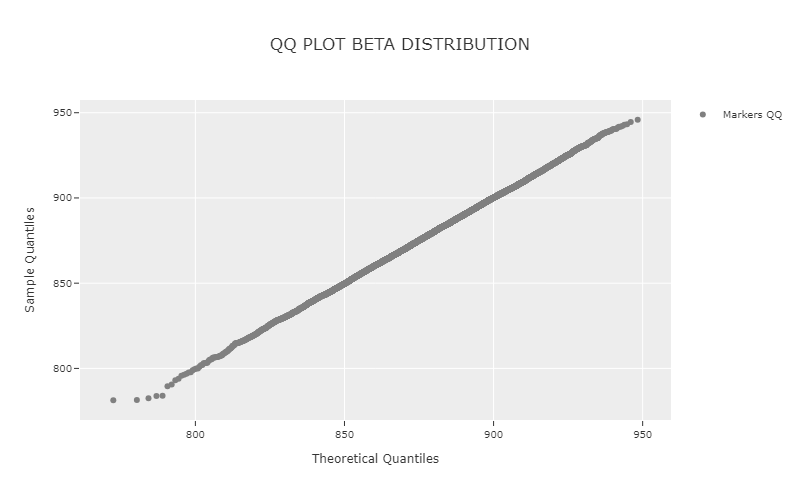
If the empirical data follows the theoretical distribution, the plotted points will align along the 45-degree reference line (