PDF Distribution
The .plot_distribution() method generates a histogram of a given dataset overlaid with a selected probability distribution. This method allows for extensive customization of the plot's appearance.
Parameters
id_distribution(str): The identifier of the probability distribution to be plotted. A complete list of available distributions is provided in the Distributions documentation.plot_title(str, optional): The title of the plot. Default value:"HISTOGRAM".plot_xaxis_title(str, optional): The title of the x-axis. Default value:"Domain".plot_yaxis_title(str, optional): The title of the y-axis. Default value:"Probability Density/Mass Function".plot_legend_title(str | None, optional): The title of the legend. IfNone, no legend title is displayed.plot_height(int, optional): The height of the plot in pixels. Default value:400.plot_width(int, optional): The width of the plot in pixels. Default value:600.plot_bar_color(str, optional): The color of the histogram bars in RGBA format. Default value:"rgba(128,128,128,1)"(gray).plot_bargap(float, optional): The spacing between histogram bars, ranging from0to1. Default value:0.15.plot_line_color(str, optional): The color of the distribution curve in RGBA format. Default value:"rgba(255,0,0,1)"(red).plot_line_width(int, optional): The thickness of the distribution curve. Default value:3.plotly_plot_renderer("png" | "jpeg" | "svg" | None, optional): The format for exporting the plot when using Plotly. IfNone, the default Plotly setting is applied.plot_engine("plotly" | "matplotlib", optional): The backend used for visualization. Default value:"plotly".
Default Usage
A histogram with an overlaid probability distribution can be generated using the following command:
python
phi.plot_distribution(id_distribution="weibull")By replacing "weibull" with any available distribution identifier, different probability distributions can be visualized.
Complete Usage Example
To customize the plot further, specify additional parameters as needed:
python
phi.plot_distribution(
    id_distribution="normal",
    plot_title="Normal Distribution Fit",
    plot_xaxis_title="Data Values",
    plot_yaxis_title="Density",
    plot_legend_title="Fitted Distribution",
    plot_height=500,
    plot_width=700,
    plot_bar_color="rgba(0,0,255,0.7)",  # Blue bars
    plot_bargap=0.1,
    plot_line_color="rgba(255,165,0,1)",  # Orange curve
    plot_line_width=2,
    plotly_plot_renderer="png",
    plot_engine="plotly",
)
This configuration customizes the title, axis labels, colors, and rendering options for better visualization.
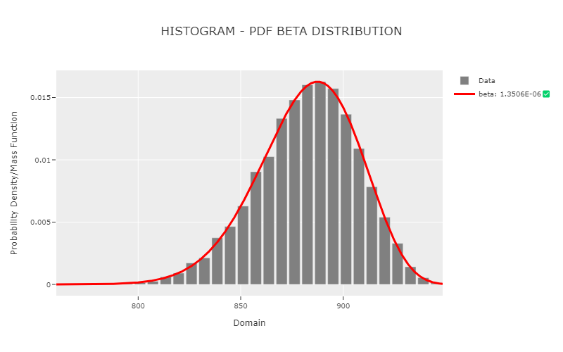
Example Visualization
The following image represents the output generated by .plot_distribution() when applied to a dataset: